Annex to the Württemberg State Library in Stuttgart
The Württemberg State Library building in Stuttgart is one of southern Germany’s preeminent architectural achievements of the 1960s. The building is impressive due to its generous sequence of spaces as well as the thoughtful choice of materials and the high quality of its architectural implementation.
By positioning the building within the urban fabric the way they did, the initial architects responded primarily to the traffic axis dictated by the flow of vehicles. The spatial idea for this street was based on the modernist notion of wanting to place free-standing structures within a field of spatial tension. The concept effectively turned the former situation of the historical streetscape on its head. If one were to examine the erstwhile Neckarstraße in photos and plans from the pre-war period, one would identify a public thoroughfare lined on both sides with distinguished architecture – a condition whose advantages we have again learned to appreciate today. The loss of this boulevard, which may not have been lavish but was nonetheless respectable, becomes clear if you are a pedestrian who is tempted to stroll along Konrad-Adenauer-Straße.
Despite all enthusiasm for the deeds of modernism – including the attempt to accelerate the flow of cars via wide lanes and underpasses, which was welcomed in the 1960s as testimony to progress – nobody showed any real enthusiasm at the sight of the urban situation. Unimpeded travel in cars was now facilitated by patronizing pedestrians: the road could only be crossed in certain places through tunnels perceived as inhospitable, or over footbridges.
What does all this have to do with Stuttgart’s state library? Well, the road improvements have meant the library has migrated to another part of the city and, unlike the situation until right after the war, emotionally it no longer seems part of the innermost city. Back then, the library and the Hohe Karlsschule were directly opposite each other. The spatial relationship made sense both historically and symbolically. Today, two buildings stand unrelated: the modest rear of the New Palace, which was never intended as a formal public façade, and the self-sufficing but handsome library building from the 1960s.
Thus, the competition to expand the state library not only raised the question of how the old building could be skilfully enlarged both functionally and spatially, but also of how to improve the urban situation. In other words, can a new built volume create a space that can be part of a future boulevard without resorting to old architectural schemes?
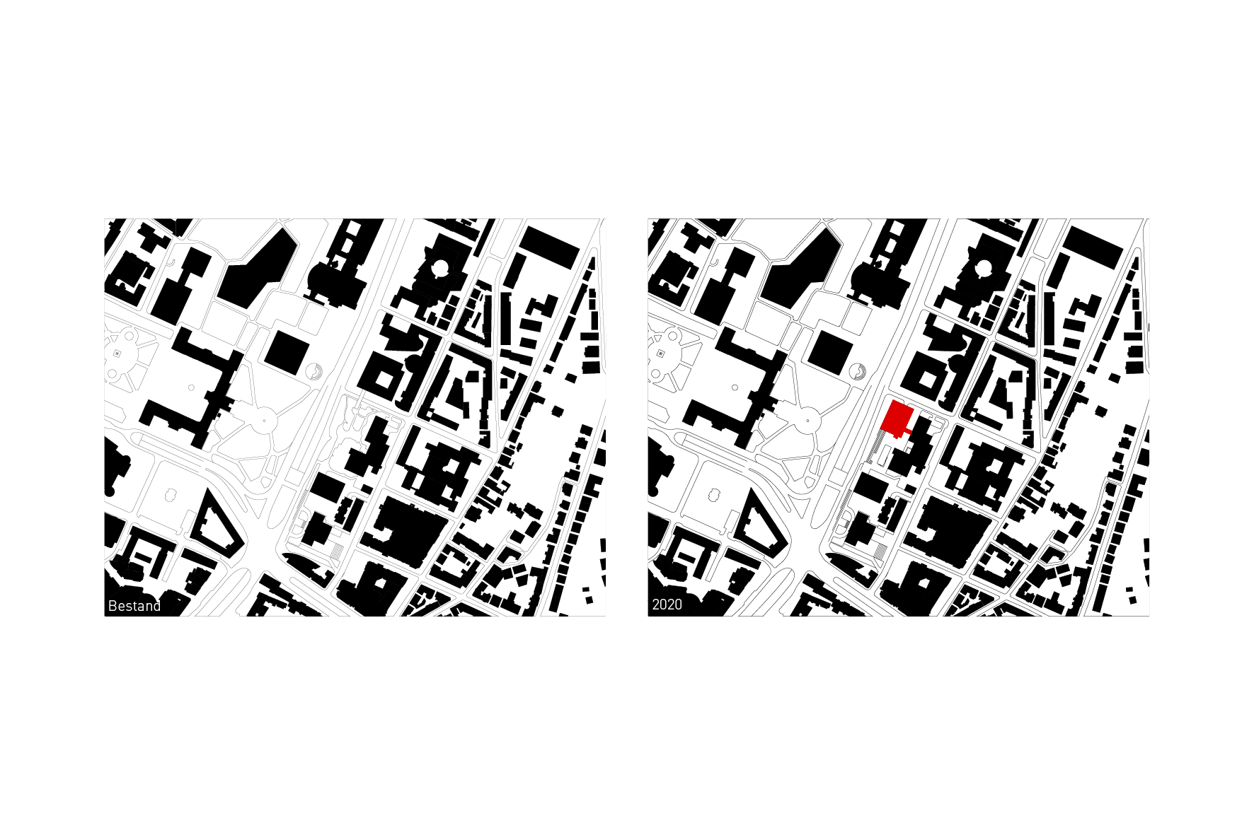
The starting point of deliberations therefore consisted, on the one hand, of positioning the building directly adjoining Konrad-Adenauer-Straße, so as to once again demarcate the space. On the other hand, the intervention to the old building was to be minimised to the addition of a bridge connecting to the first floor.
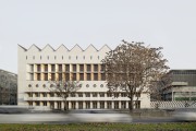
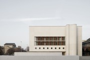
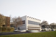
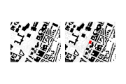
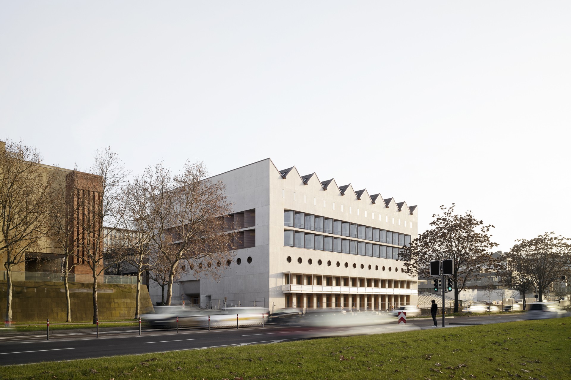
The annex building now directly fills the corner of Ulrichstraße and Konrad-Adenauer-Straße. The pavement for pedestrians, which begins with the tree-lined avenue at the Staatsgalerie and currently ends at Ulrichstraße, will be extended to the State Archives building and hopefully continued to Charlottenplatz at a later point in time. The new building, which roughly adopts the ridge height of the Wilhelmspalais, is set apart from the original building to provide space for a path between the two buildings that enables a link from Urbanstraße to the lower level of the building complex. Construction of the new underground car park creates a generous plaza at what was previously the entrance level, which is flanked by the State Archives on far side. Urbanistically, the cubic volume of the old reading room, which now occupies the middle of the new plaza, forms a relationship vis-à-vis the central projection of the palace across the street. Ample steps establish a connection to the new pavement at street level.
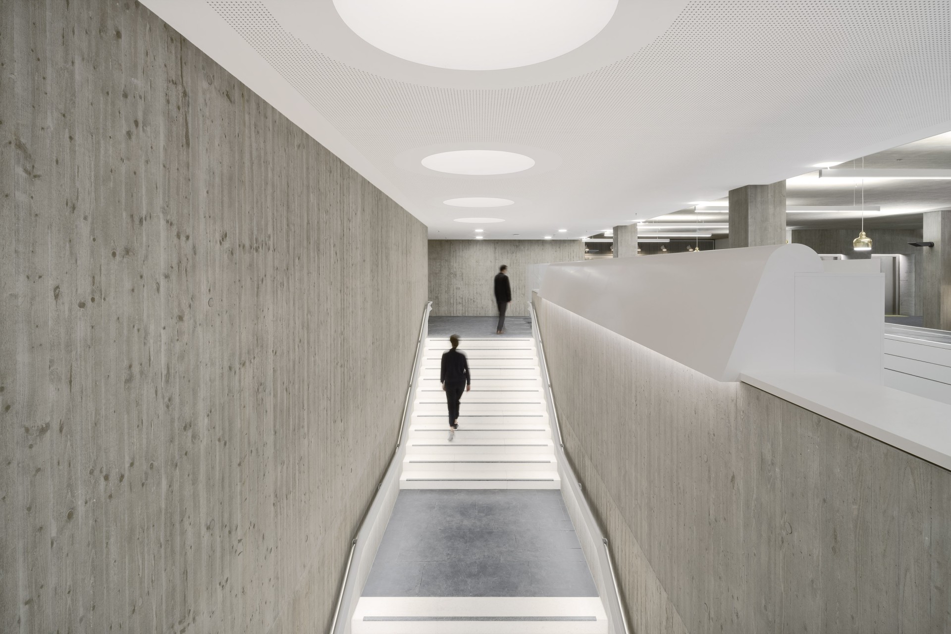
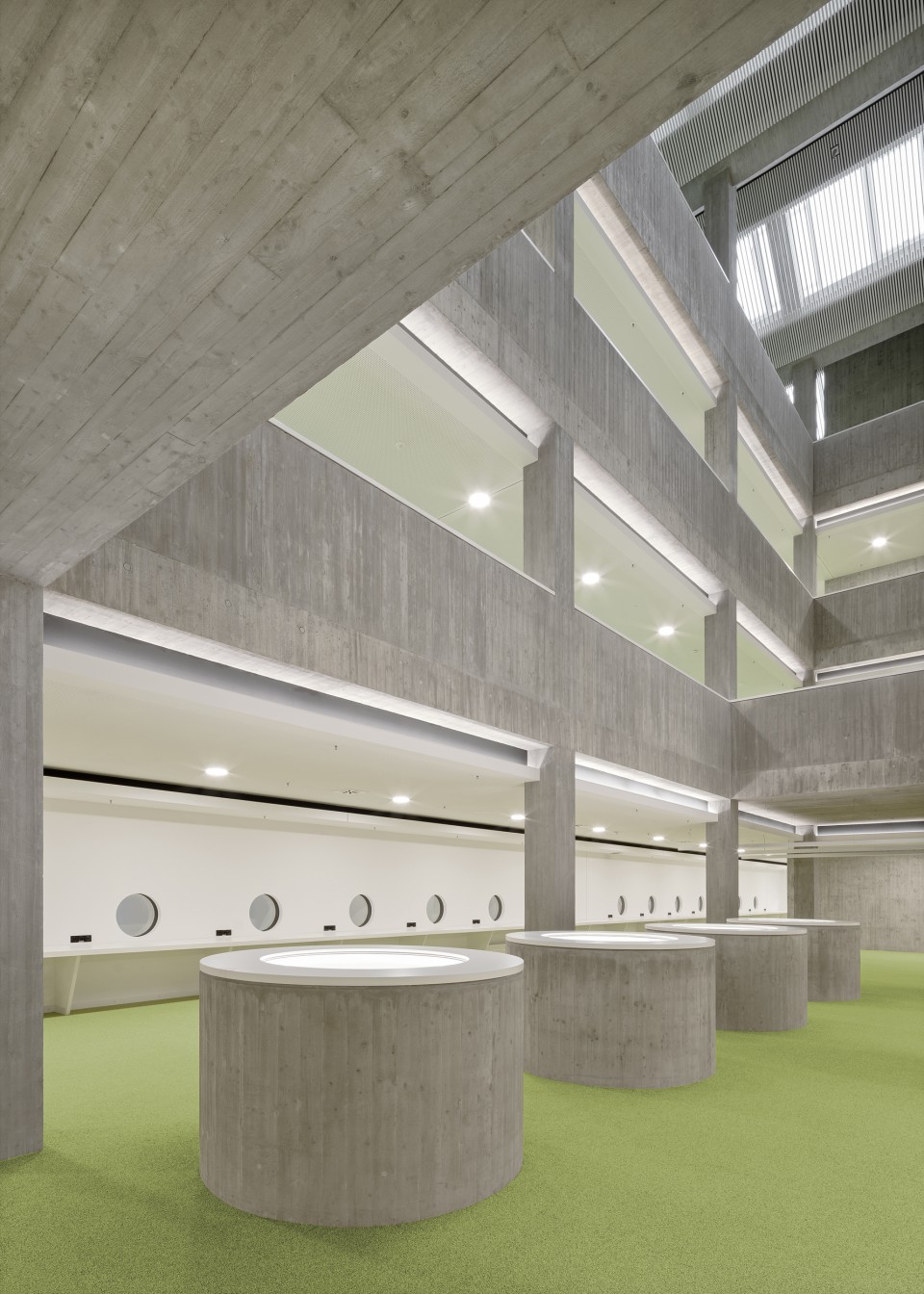
The building can now be accessed at both levels. The lower level will also house the future cafeteria, which opens onto the street and can operate independently of the library. The main entrance to the library is on the level above. From there, library-goers reach the lobby with the requisite information counters, entry points to the controlled access zone, the book return, and a hall and exhibition area that opens out to Konrad-Adenauer-Straße. There, some of the spaces are two storeys high, because for economic reasons the ceiling heights of the typical storeys are considerably lower.
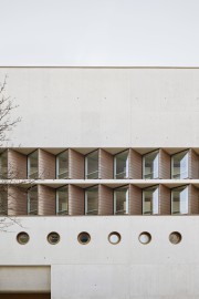
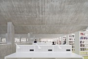
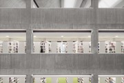
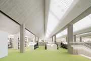
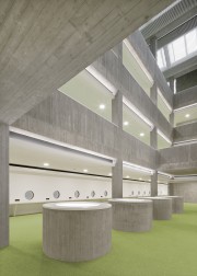
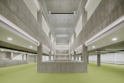
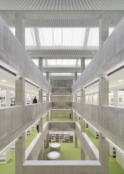
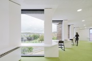
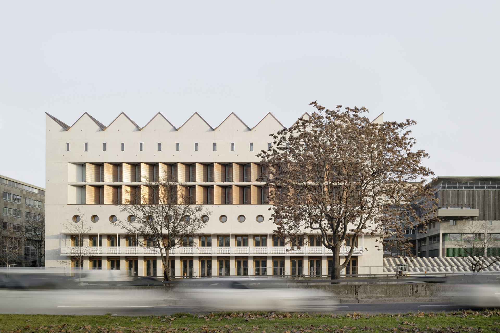
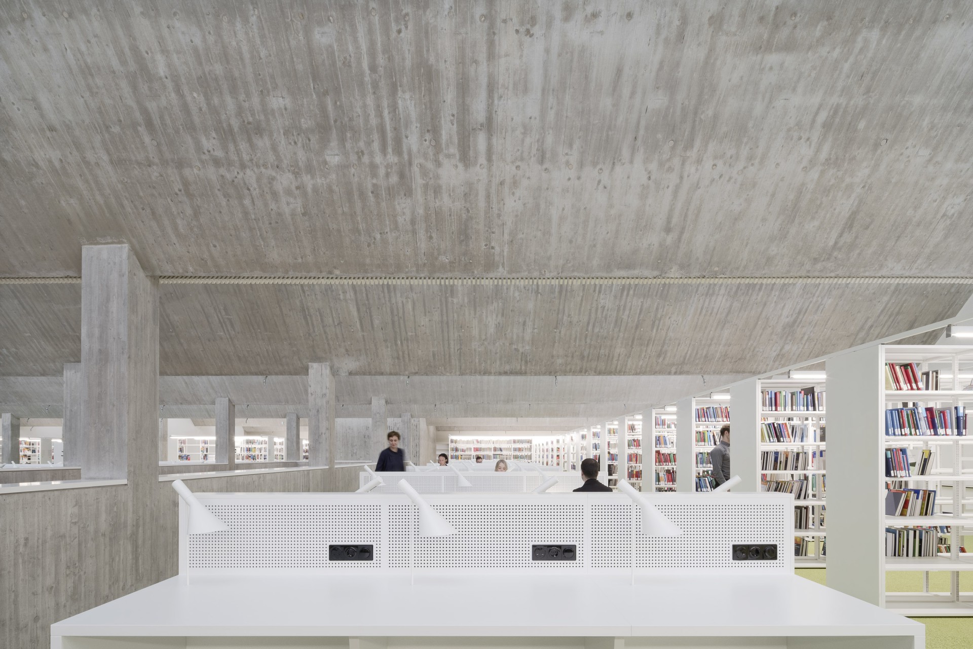
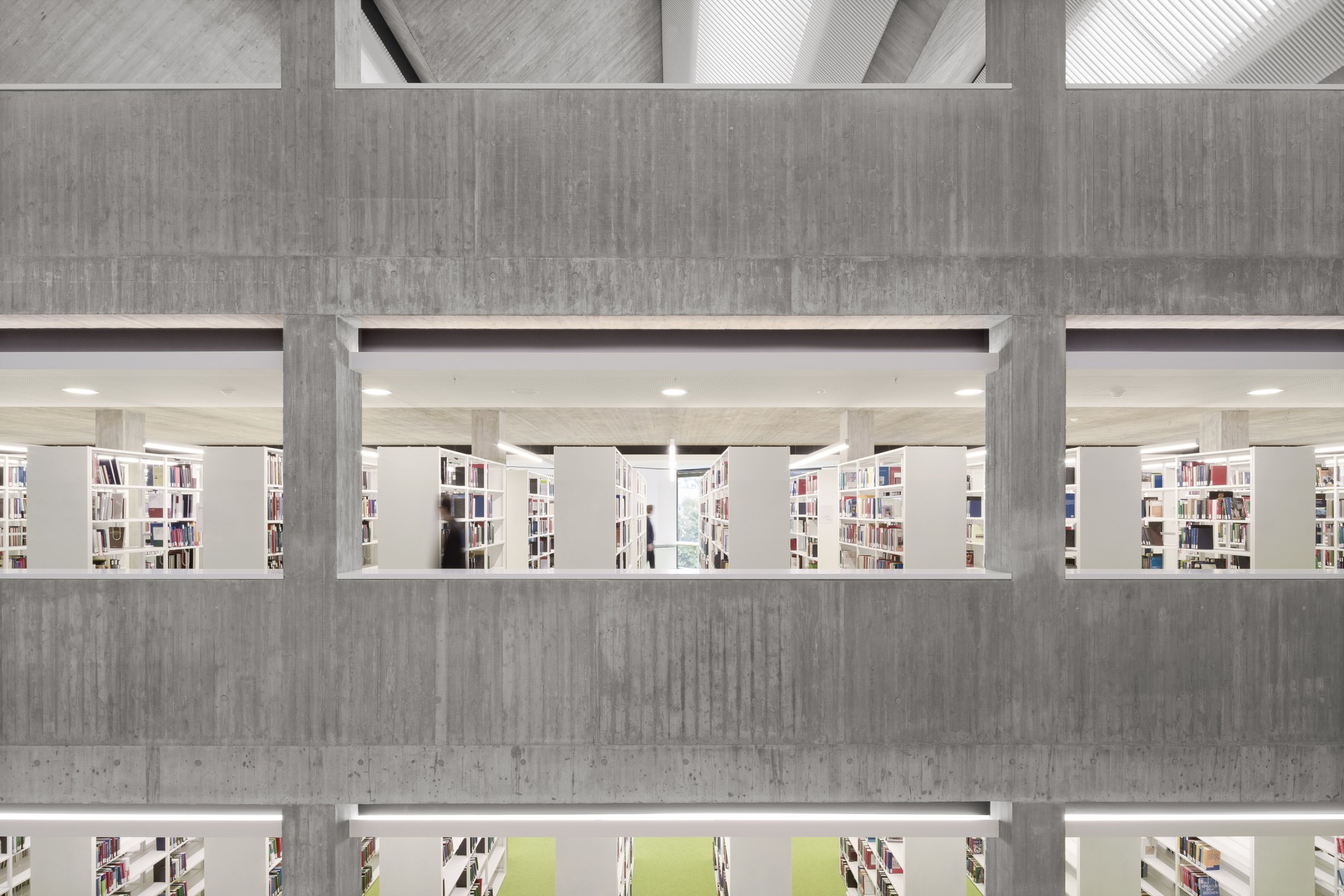
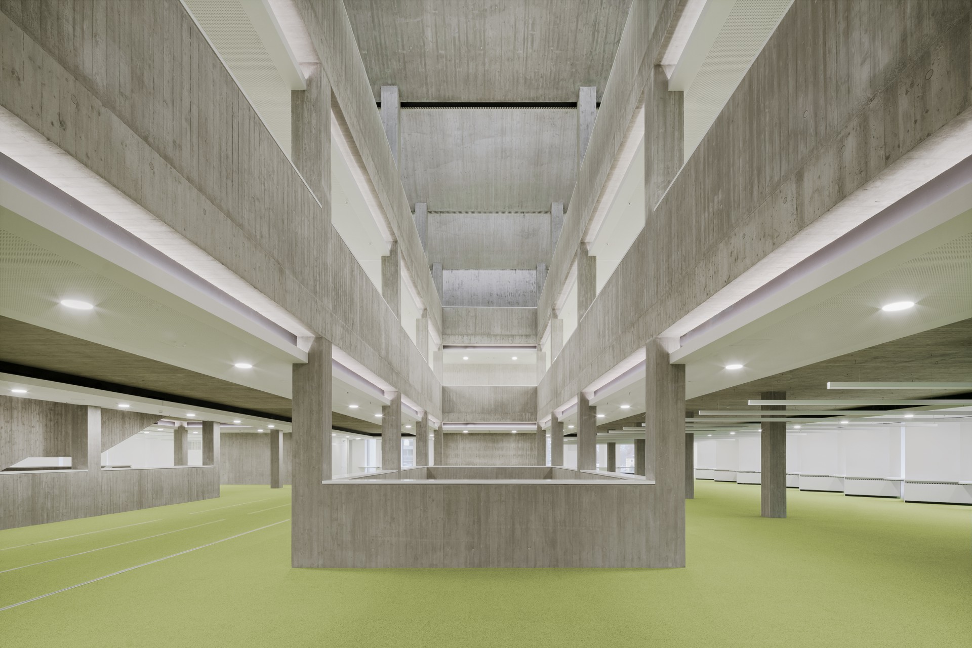
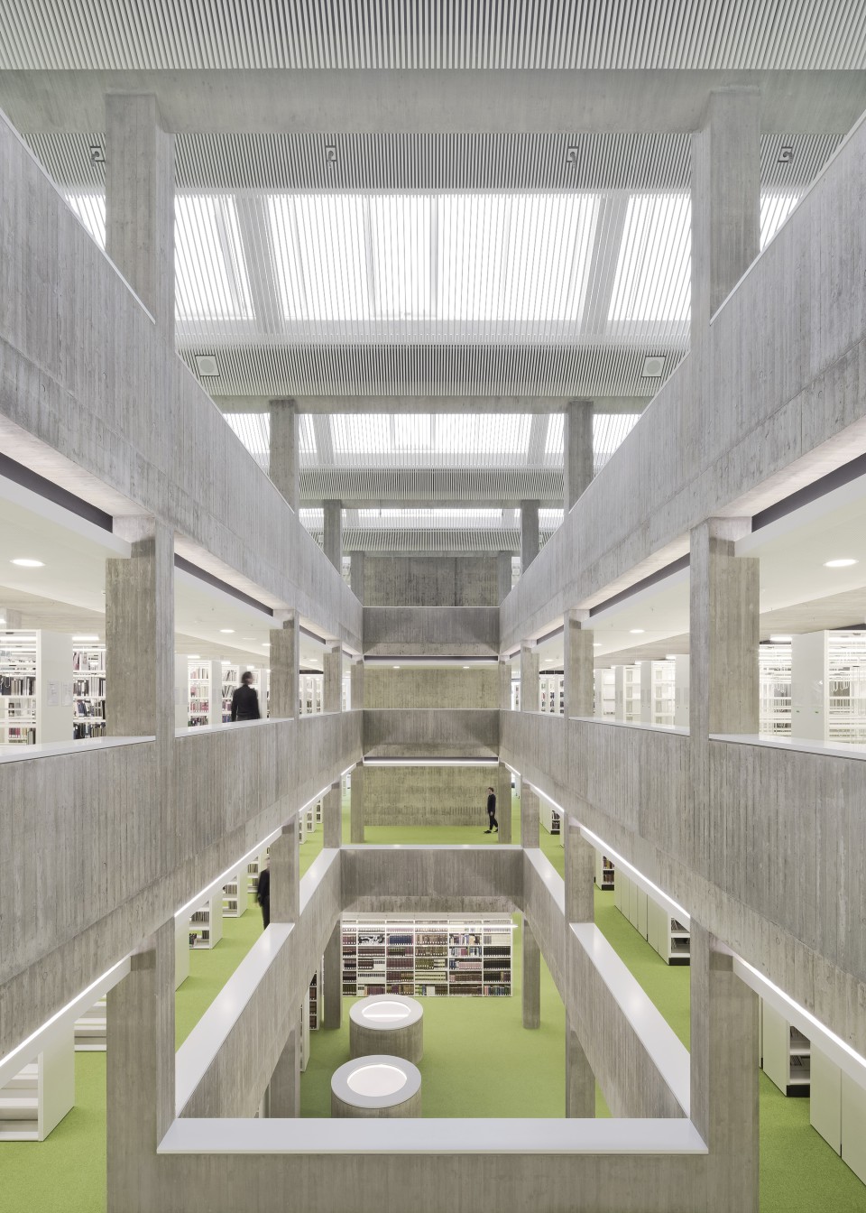
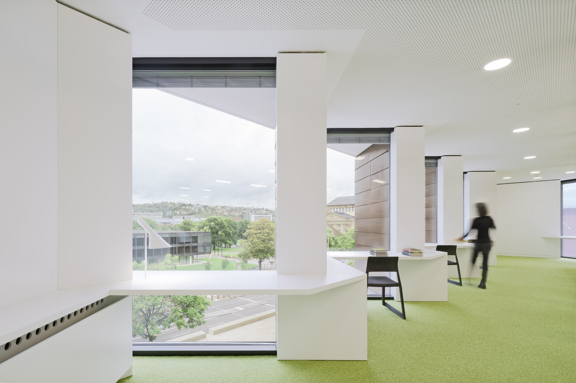
On the first floor, which is accessible via a staircase within the controlled access zone, the connection to the old building is situated directly at the top of the stair. The central part of the floor is occupied by shelves. Along the length of the building on both sides, open workstations are lined up in rows towards the hall, with supplemental administrative rooms opposite them. An atrium visually connects this level to the other three floors above. On the second and third floors, the reading desks are located along the zigzag exterior walls. The top floor is, by contrast, laid out in reverse: here the reading desks are placed in the middle – because on this level, the folded roof structure enable us to direct daylight into the centre of the building.
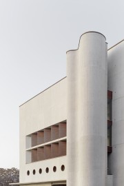
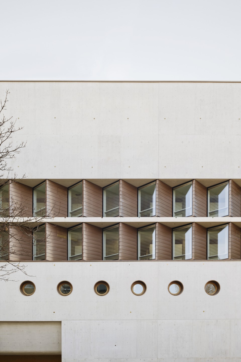
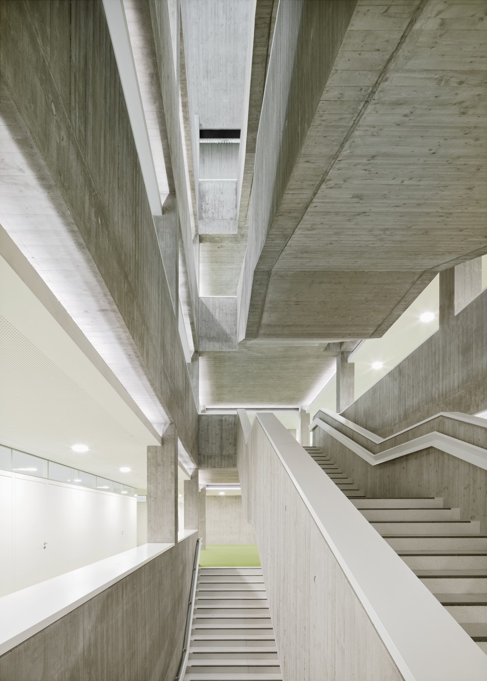
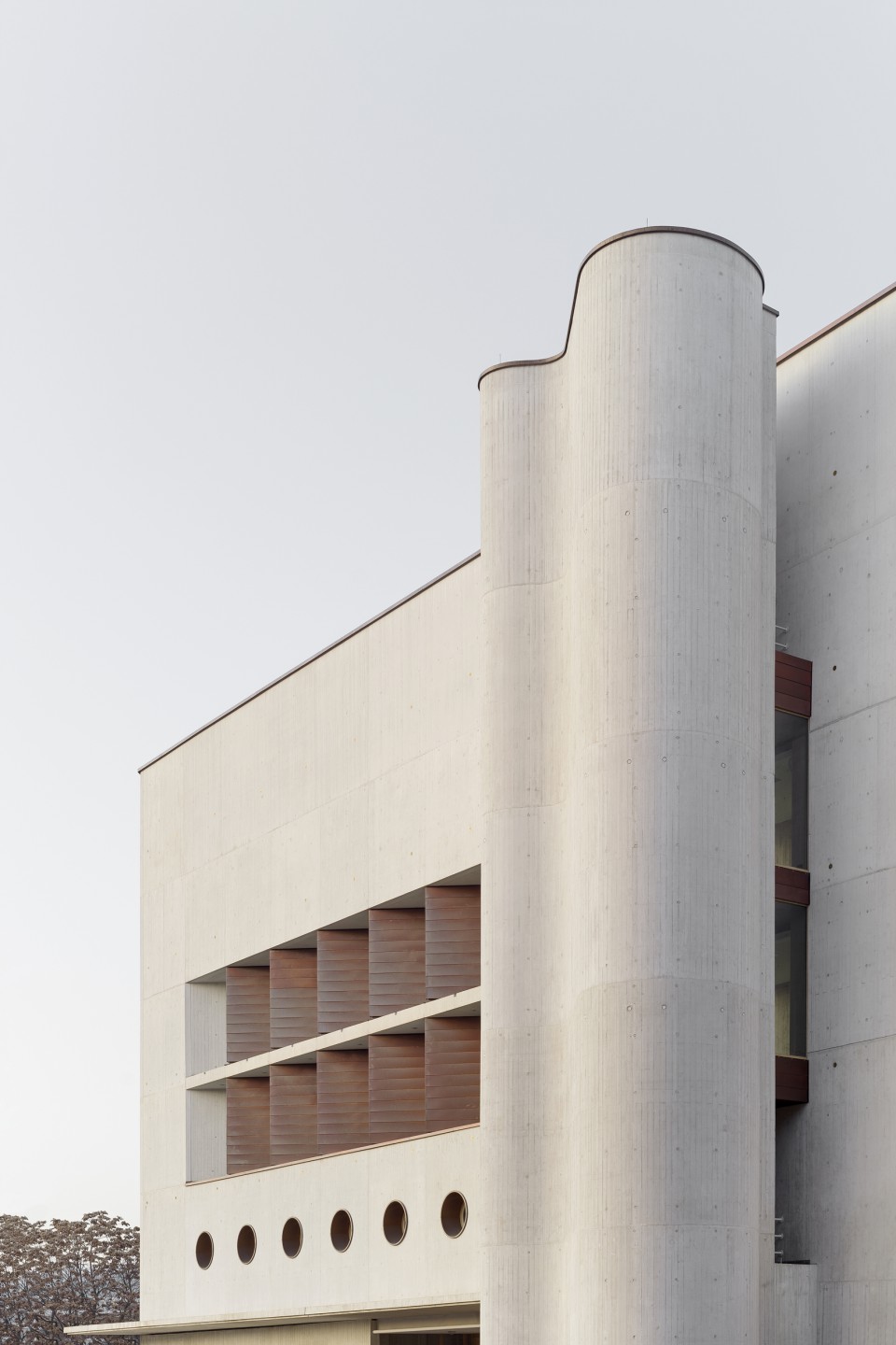
At first glance, the new building has the appearance of an independent entity. The fact that it constitutes an annex to the old building is made clear by the choice of materials, dominated by exposed concrete cast with board formwork, creating echoes of the old in the new building. For the façade, white cement and titanium dioxide pigment were used for the concrete in order to achieve a light colouration. The outer surface of the exposed concrete façade is a cast-in-place concrete wythe that hangs in front of the load-bearing concrete walls, with core insulation in between. The formwork was made by hand from rough-sawn boards, whose dimensions match those of the existing building and which were applied to backing panels with a uniform joint and nailing pattern and then pre-aged with cement slurry. The work was executed by the infrastructure division of the construction company Max Bögl, which has great experience in casting exposed board-formed concrete.
The copper cladding of the old reading room finds its counterpart in the solid panels of the zigzag façades on the second and third floors. Like the existing building, the roof of the annex building is also covered with copper.
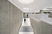
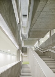
Inside the building, light colouration of the concrete was omitted for cost reasons. The concreting of the exposed concrete staircase inside the library area and the wide-span beams of the north-facing sawtooth roof on the fourth floor posed special challenges. There, too, the formwork was made by hand with rough-sawn boards applied to backing panels. Reusable formwork with repeating patterns was avoided throughout the building. Thus the quality of the exposed concrete reveals the efforts and skills of the formwork makers every bit as much as the weather conditions at the time of concreting. The rough and lively surfaces of the exposed concrete are contrasted with the smooth white surfaces of the suspended ceilings and wood cladding. Light green carpeting and white furnishings create a bright and cheerful atmosphere that contrasts with the muted tones of the existing building.
Client:
Landesbetrieb Vermögen und Bau Baden-Württemberg,
Amt Stuttgart
Architects:
Lederer Ragnarsdóttir Oei Architekten, Stuttgart
Team:
David Fornol, Simone Neuhold, Dr. Anwar Algeith, Kazu Itho, Maximilan Löffler, Sophia Schmidt, Matthias Schneider, Anna Schönhoff, Luise Wegehaupt, Ugur Yilmaz
Landscape planning:
Lederer Ragnarsdóttir Oei Architekten, Stuttgart
und Helmut Hornstein, Überlingen
Structural Engineering:
Leonhardt, Andrä und Partner, Stuttgart
Engineering for technical building facilities:
ZWP, Stuttgart
Electrical engineering:
Inros Lackner, Rostock
Structural physics:
GN Bauphysik, Stuttgart
Fire protection planning:
TRIAS, Stuttgart
Competition:
12/2010 – 2. Preis
Construction period:
2015 – 2020
Gross floor area:
20.300 m2
Effective Area:
11.300 m2
Location:
Konrad-Adenauer-Straße 10, 70173 Stuttgart
Awards:
Shortlist DAM Preis 2022
Deutsches Architekturmuseum
Hugo-Häring-Auszeichnung 2020
BDA Stuttgart /Mittlerer Neckar
Preisträger Architekturpreis Beton 2020
Bundesverband der Deutschen Zementindustrie e.V. / BDA
Beispielhaftes Bauen Stuttgart 2019-2023
Publications:
Deutsches Architekturjahrbuch 2022.
DAM und JUNG | Yorck Förster, Christina Gräwe, Peter Cachola Schmal (Hg.):
dom publishers Berlin 2022
Lederer Ragnarsdóttir Oei 2.
Lederer, Arno / Ragnarsdóttir, Jórunn / Oei, Marc (Hg.)
Jovis Verlag Berlin 2021
Architekturführer Deutschland 2022
Berlin 2021
betonprisma
05 | 2021
Arquitectura Viva 234
05 | 2021
Bauwelt
03 | 2021
deutsche bauzeitung
01 | 2021
DETAIL
12 | 2020
wettbewerbe aktuell
11 | 2020
Stuttgarter Zeitung
16.10.2020
Callwey München mit dem BDA (Hg.):
Beton
2020
Stuttgarter Zeitung
06.10.2020
WLBforum
22. Jahrgang 02 | 2020
Dennis Krause
Architektur und Wissen. Räume für die Zukunft.
Münster: Deutscher Architektur Verlag, 2022
beton.org
31.07.2022
Zement+Beton
1_26
Photos:
Brigida González, Stuttgart

